Exploring SwiftUI DatePicker Styles
SwiftUI provides a versatile and user-friendly way to implement date pickers in your iOS apps. Let's explore the capabilities of SwiftUI's DatePicker by delving into a Swift code example.
Introduction
The DatePicker in SwiftUI allows users to select dates or times, and it comes with various customization options. In the code snippet provided, we have a DatePickerView containing different sections showcasing the DatePicker's features.
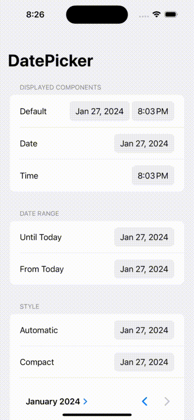
Displayed Components
By specifying the displayedComponents, you can choose whether to show the date, time, or both. For instance:
DatePicker("Default", selection: $date)
DatePicker("Date", selection: $date, displayedComponents: .date)
DatePicker("Time", selection: $date, displayedComponents: .hourAndMinute)
These examples display the default, date-only, and time-only pickers, respectively.
Date Range
You can limit the selectable dates by using the in parameter. For example:
DatePicker("Until Today", selection: $date, in: ...Date(), displayedComponents: .date)
DatePicker("From Today", selection: $date, in: Date()..., displayedComponents: .date)
In these instances, the first DatePicker allows selection up to the current date, while the second one only allows dates starting from today.
Styles
The final section showcases different styles available for the DatePicker. SwiftUI provides styles such as .automatic, .compact, .graphical, and .wheel. Here's how you can apply them:
DatePicker("Graphical", selection: $date, in: ...Date(), displayedComponents: .date)
    .datePickerStyle(.graphical)
// ... other styles
Experiment with these styles to find the one that best suits your application's design.
Reference and Repository
For further details and documentation, you can refer to the official SwiftUI documentation on DatePicker.
If you'd like to explore the code or contribute, the source code is available in the GitHub repository: https://github.com/trevisxcode/Calendars.
Happy coding!